

Ono Sokki Co., Ltd. (President: Yuji Ogoshi), a manufacturer and seller of electronic measuring instruments, will launch the "Test Result Visualization Software ExSummary" on March 18, 2026. This software enables efficient data analysis and report creation by graphing vast amounts of test result data through intuitive operations.
-
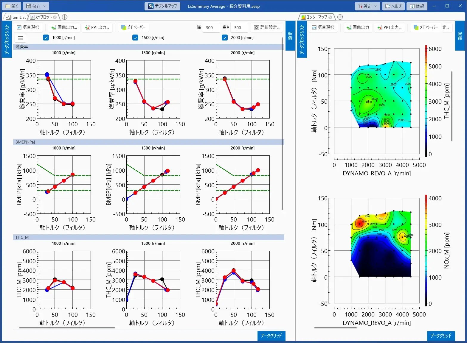
Examination Results Visualization Software ExSummary
In development tests and evaluation tests, the work of graphing the collected measurement data and conducting analysis and report preparation is performed on a daily basis. To graph the measurement data, it is necessary to organize the data files, and there is a challenge that the work leading up to graph creation takes a lot of time and effort.
By importing the collected data into "ExSummary," it is possible to seamlessly complete everything from data organization to graph creation and report preparation, contributing to the efficiency of reporting tasks.
Three Key Points of the New Product
- Supports various types of graph displays - capable of creating XY plots, contour maps, and digital maps.
- Efficient report creation through image output and PowerPoint output functions.
- The on-time monitoring function supports the suppression of rework in testing and the improvement of test quality.
Target market and main applications
- Development and evaluation departments of automobile and automotive equipment manufacturers, agricultural machinery, ships, and generator manufacturers and suppliers.
- Testing and Evaluation Department of an Electronic and Industrial Equipment Manufacturer
- Testing equipment manufacturers and testing service providers
- Experimental and data analysis in research and development institutions and universities.
Features
- Various graph displays to visualize trends in measurement data
By importing measurement data, you can create XY plots, contour maps, and digital maps.
-
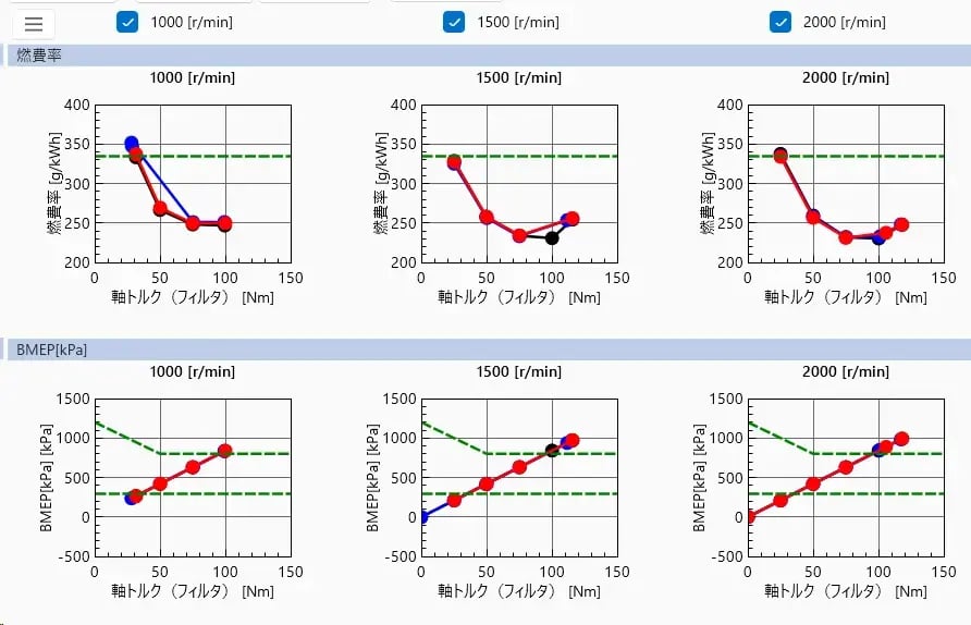
XY plot (scatter plot) -
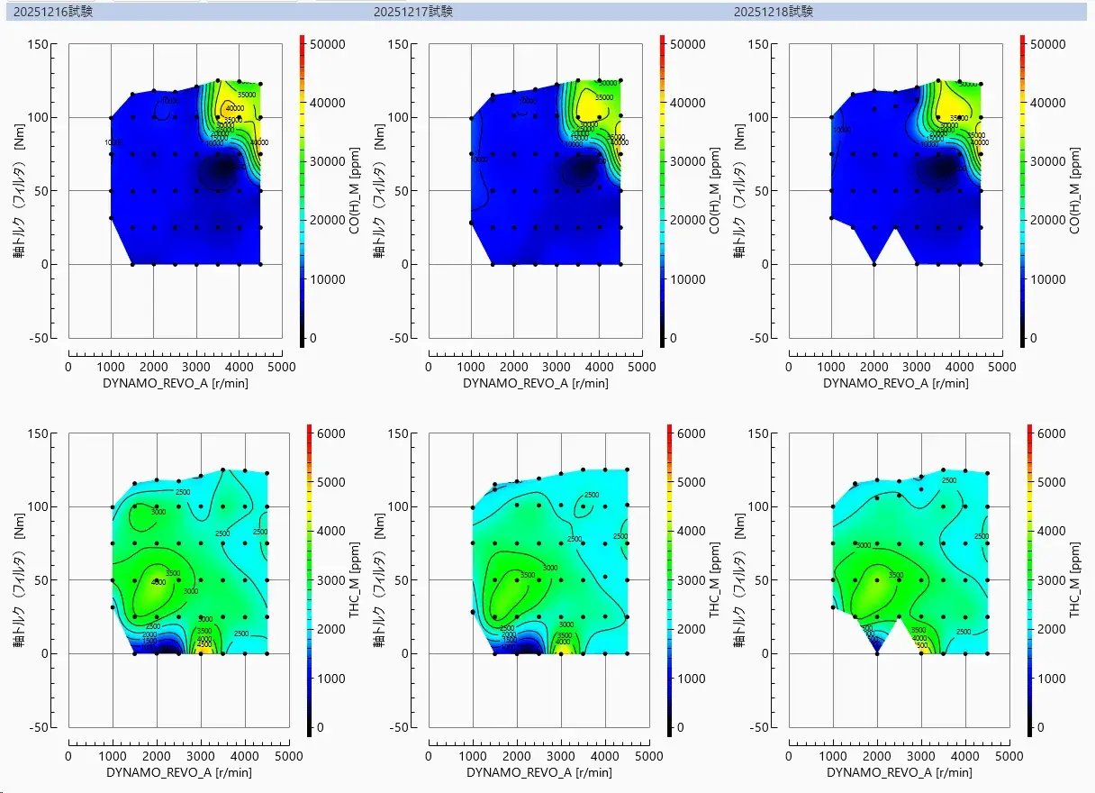
contour map -
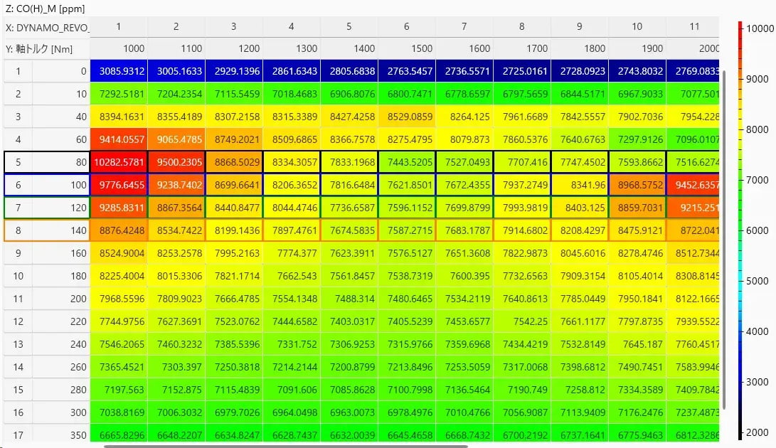
digital map
The XY plot is equipped with a function that automatically sorts data according to the purpose of the test and displays it as a scatter plot. Contour maps and digital maps can perform interpolation processing, allowing users to check contour lines and numerical interpolation results, even when the imported 3D data is not grid-like.
- Report creation using image output and PowerPoint output
The created graphs can be output as images, and can also be saved in PowerPoint format. If you use a template specified by the customer, it can be utilized directly as a report.
-
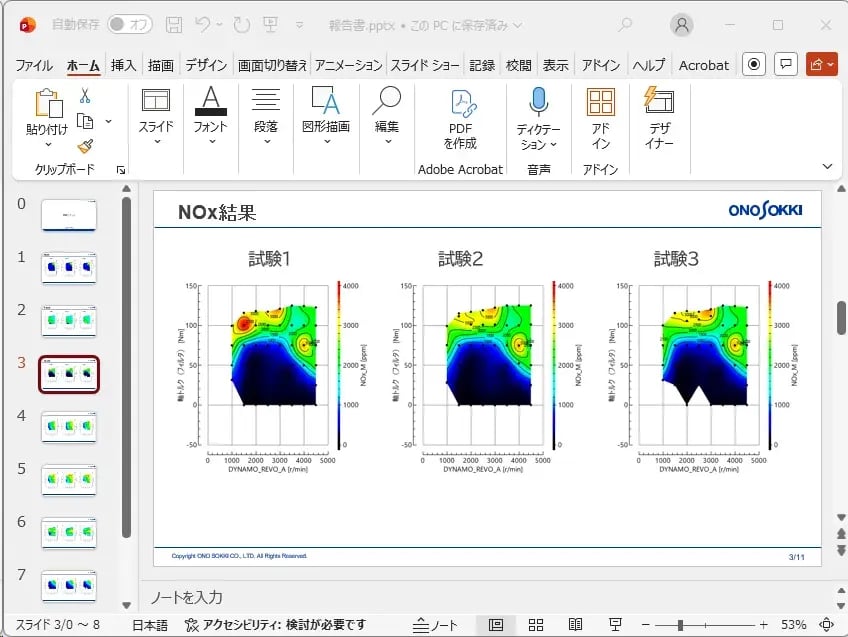
Example of output in PowerPoint format.
- On-time monitoring function
is a feature that allows you to load data files immediately after recording and check the drawing results instantly.
By using it with bench systems like FAMS-R6, it enables immediate detection of abnormal values, contributing to the reduction of rework in testing and the improvement of test quality.


